And when I became an adult, I discovered a playful world map that I couldn't help but think, "If I had this, I might have liked studying social studies more!"! It's ... a " food world map "! !!
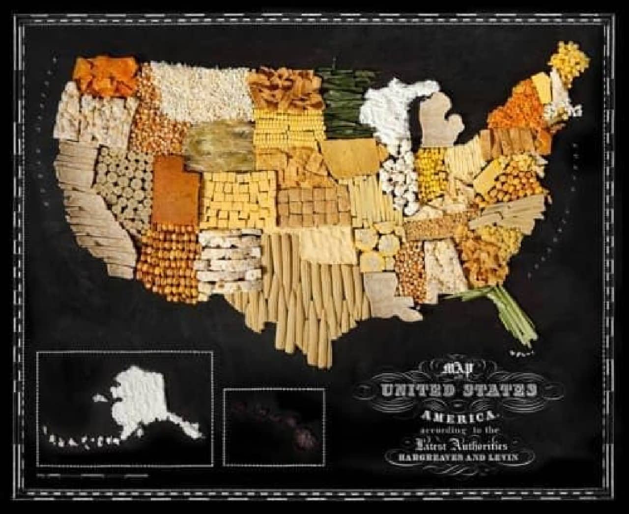
If I had this, I might have liked social studies more ... (Source: hargreavesandlevin.com)
According to overseas media Fine Dining Lovers, the "Food World Map" is a world map designed using "symbolic food" from around the world. It's a collaboration between food photographer Henry Hargreaves and stylist Caitlin Levin.
For example, India's “spice” and New Zealand's “kiwi” are represented side by side in each country's terrain.
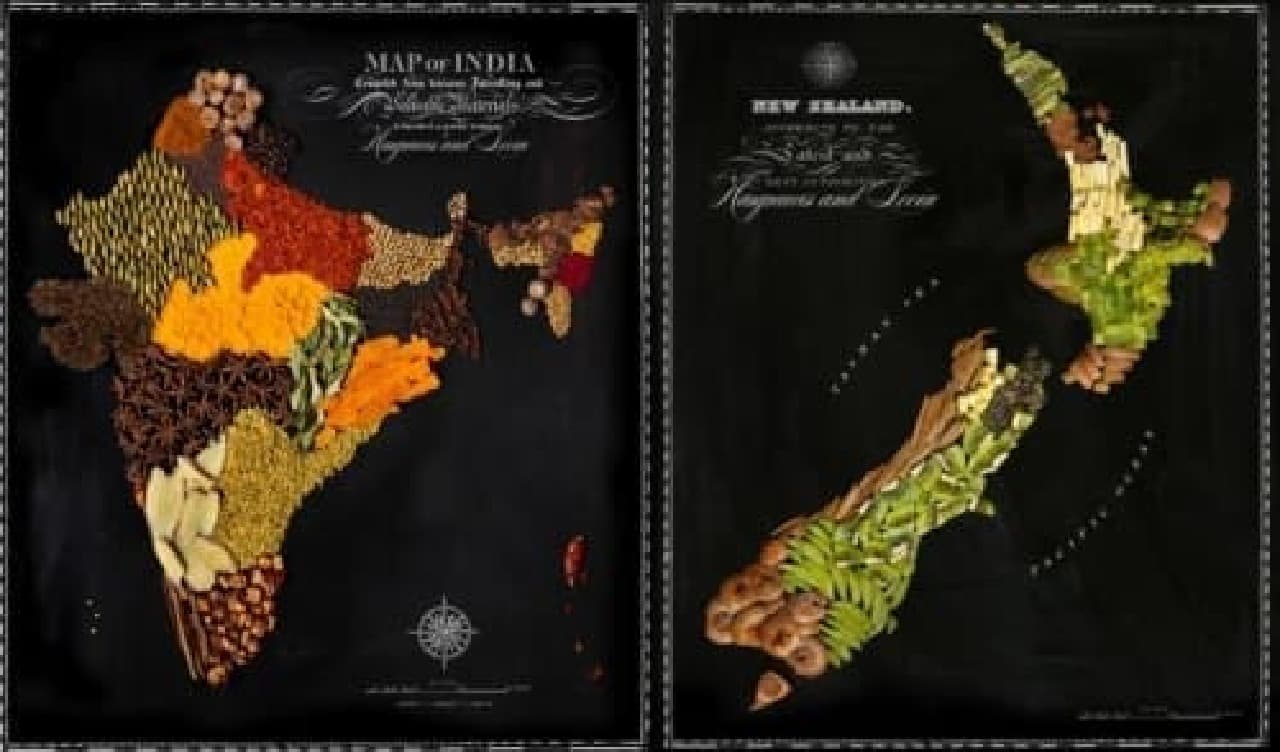
India made of spices (left) and New Zealand made of kiwi (right) (Source: hargreavesandlevin.com)
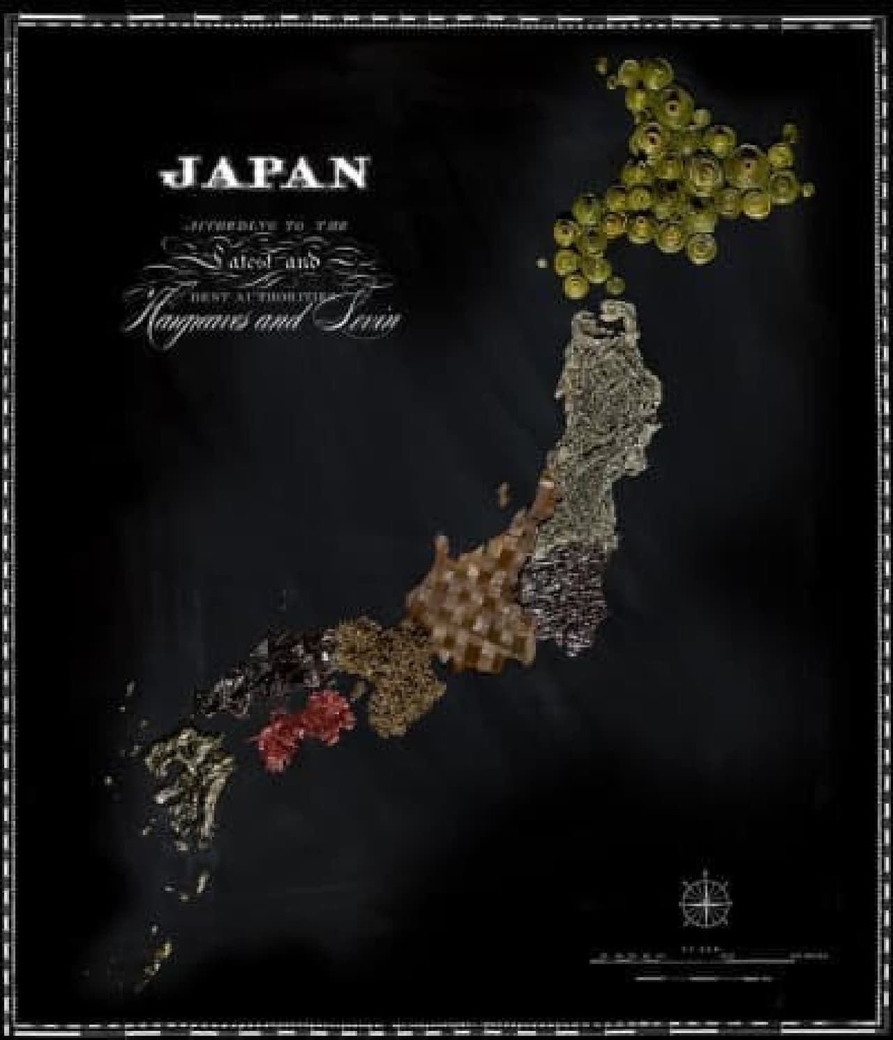
By the way, Japan is a seaweed ! It must be unique, but it's a seaweed! !! (While writing, I noticed that I was drinking seaweed miso soup ...)
Thank you for your continued support (Source: hargreavesandlevin.com)
According to the media, Hargreaves said of the food world map:
"This is a project that conveys how food has connected people around the world and created dialogue. We hope that this beautiful map will connect people around the world as well. ing"