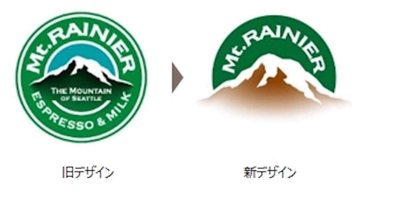
Mount Rainier Logo and
Packaging Renewal
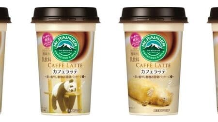
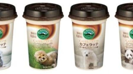
Morinaga Milk Industry's Mount Rainier logo and packaging will be successively renewed starting February 13.To mark the 30th anniversary of Mount Rainier, the product design concept of Mount Rainier has been reviewed, and the logo and packaging will be renewed with a modern design. In addition to conveying the taste and quality of the products, the lineup will be expanded and enhanced so that a wider range of people can enjoy the products according to their moods, scenes, and preferences, and various promotions are also planned.
Logo Design
The brand name "Mt. Rainier" is derived from Mt. Rainier, located southeast of Seattle. The mountain peeking out from the city is a symbol of peace and tranquility for people living in Seattle.Like Mt. Rainier, it will never change, never waver, and always be there for you. The new design emphasizes Mt. Rainier more than before, with the hope that it will remain unchanged and unwaveringly close by.
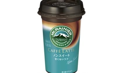
The "STANDARD" products, which are sold year-round, have been given a matte metallic finish, and their familiar
packaging
has been substantially redesigned to reflect a commitment to quality and a sense of luxury.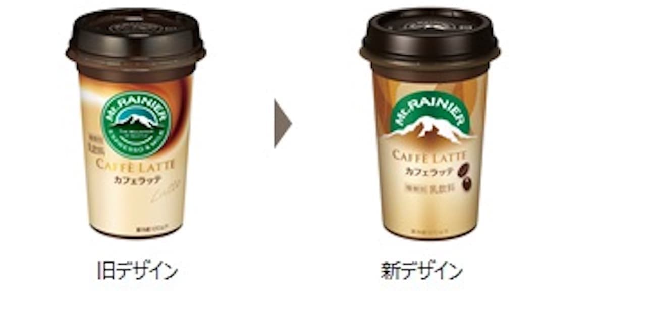
In addition, the previously unified format of coffee and milk (brown and white) swirls to express sizzle and deliciousness has been replaced with a modern design that expresses the characteristics of each product.
![Chirole Chocolates [Hokkaido Melon]: Melon-flavored Chocolate with a Rich Melon Jelly! A juicy and satisfying piece of chocolate!](https://image.entabe.jp/upload/articles/54627/acc3b61aeb4276b095f3e82e05cde06c_related.jpg)